Credible first impression
A polished interface that reflects the quality, care and character behind your business.
Web design service
Your website should make a confident first impression, explain what you do without friction and give the right people a clear next step. We design modern interfaces and reusable systems around your brand, your audience and the decisions your visitors need to make.
Why design matters
Good design is not decoration added after the strategy. It helps visitors understand your offer, judge your credibility and move through the site with less effort.
Different pages use different patterns, spacing and messages, so the business feels less considered than it is.
Important information is buried in menus or presented in an order that does not match how people decide.
Layouts collapse, controls become awkward and the experience loses clarity on the device many customers use first.
Generic layouts and mismatched imagery make it difficult for visitors to recognise what makes your business distinctive.
When every element shouts, visitors cannot tell what to do next or which action matters most.
Low contrast, small targets and unclear states can exclude people and make the site harder for everyone to use.
Without a design system, every new service or campaign becomes another one-off design decision.
Strong content can still underperform when hierarchy, proof and enquiry points are not planned together.
What we deliver
We turn your positioning, content and customer journeys into a coherent interface that can be built, maintained and extended. Each decision has a reason, not just a visual preference.
Page groups, navigation and content hierarchy organised around what visitors need to know and do.
Colour, type, spacing, imagery and interface details that make the brand feel recognisable and current.
Key journeys mapped from first visit to enquiry, booking, purchase or another meaningful action.
Reusable components and layouts designed deliberately across mobile, tablet and desktop sizes.
Clear hierarchy, proof, calls to action and forms placed where they support confident decisions.
Readable content, sensible focus states, clear controls and inclusive interaction choices.
Headings, cards, comparisons and supporting sections that help people scan, understand and trust.
A practical reference for developers and your team, including components, states and usage guidance.
See the design language
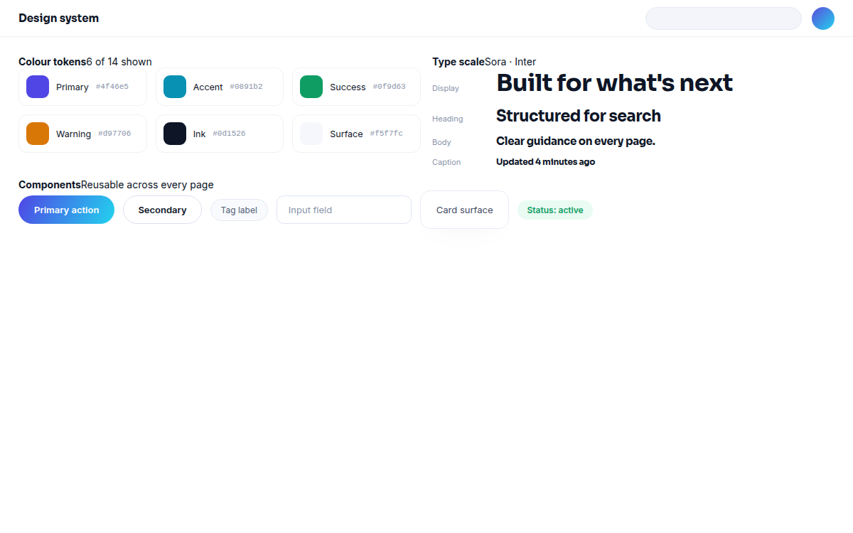
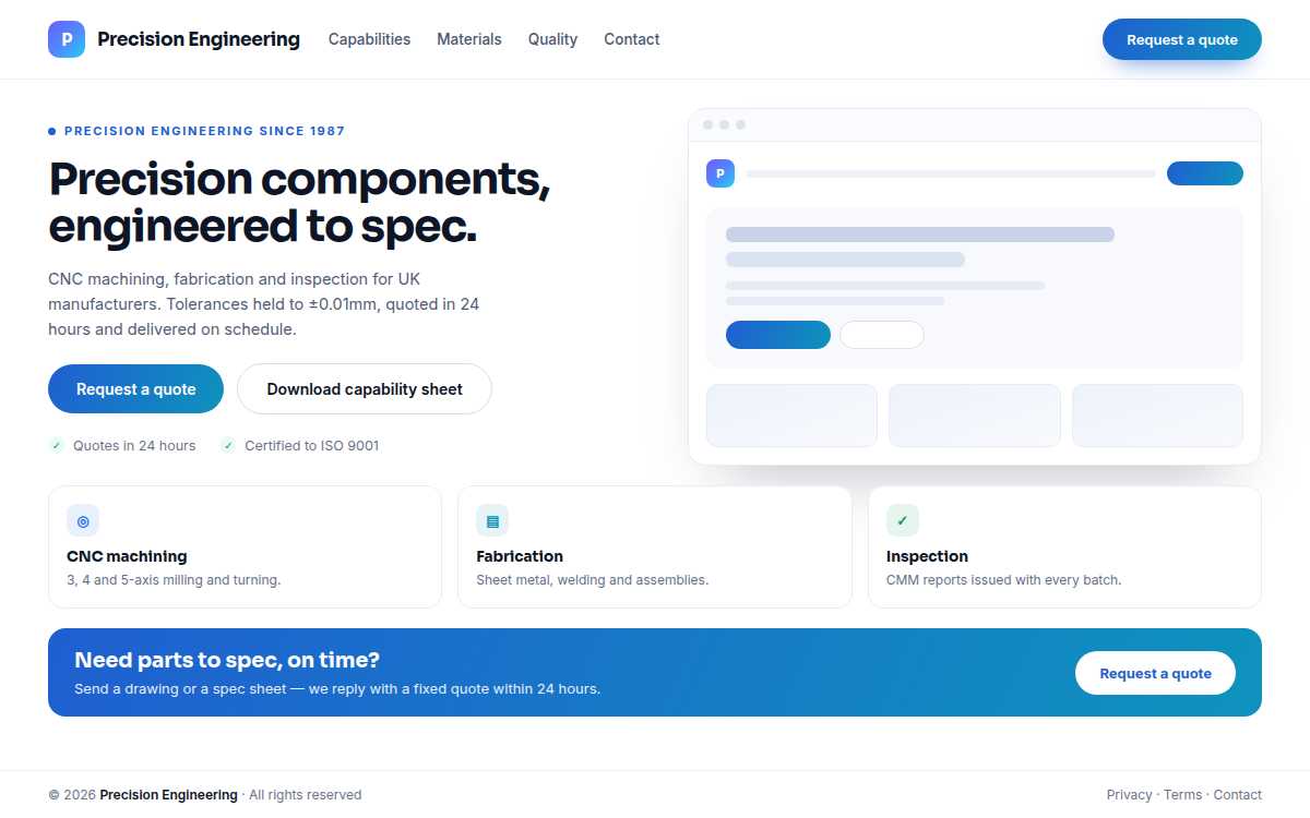
Design decisions become more useful when they are visible together: the tokens, components and page hierarchy should make the next screen easier to create and easier to understand.
The intended outcome
Design cannot control every decision a visitor makes. It can remove unnecessary friction, express your value clearly and give the rest of the website a dependable foundation.
A polished interface that reflects the quality, care and character behind your business.
Visitors can understand the offer, find supporting detail and identify the next step sooner.
The experience remains intentional when people switch from a phone to a larger screen.
Reusable patterns reduce design drift when you add services, content or campaigns.
Page structure supports enquiries and other goals without making every section feel like a sales pitch.
Accessible, considered design gives development, SEO and future optimisation a clearer starting point.
How the project runs
We keep the work collaborative without asking you to manage every design detail. You provide the business context and decisions; we turn it into a system that can move into build with confidence.
We start with your business, not your pixels. What the website is supposed to do, who it serves and where it currently loses people.
A structured review of design, UX, performance, technical SEO, content and conversion paths — with findings ranked by business impact.
A clear roadmap for the upgraded website: structure, priorities, technology, content plan and what happens in which order.
The new visual experience — page by page, device by device, built as a reusable design system rather than one-off screens.
Clean, standards-based build with the integrations, CMS and automation your team needs to run the site confidently.
Speed, Core Web Vitals, technical SEO, accessibility, mobile experience and conversion paths — measured and refined.
A controlled deployment, tracking in place, and a growth plan for what comes after go-live.
Web design questions
The best design work begins with a useful brief. These are the questions we hear most often when a business is considering a new interface.
Yes. We can apply an established identity carefully, refine parts that are no longer serving you, or create a clearer digital expression of the brand. We will separate brand decisions from website decisions so you know what each recommendation is solving.
Yes. Responsive behaviour is designed from the start rather than left for development to guess. We consider content priority, navigation, touch targets, type and layout changes across the main screen sizes.
We can structure and refine content as part of the design process, and we can work with copy you supply. If dedicated copywriting is needed, we will identify that requirement rather than hide it inside a visual design task.
We start with the actions that matter and the questions visitors need answered before taking them. That informs hierarchy, proof, calls to action, forms and the sequence of sections; it is not a matter of adding more buttons.
The agreed page designs, responsive states and reusable interface patterns, with notes that explain important behaviour. The exact handoff is shaped around the build method so the design remains useful during development.
Often. A focused review can identify the screens, journeys or components that need attention first. If the underlying structure is the real constraint, we will explain why a wider redesign would be more coherent before recommending it.
Pairs well with
Tell us what is not working in the current experience, who you need to reach and what a successful next step looks like. We will help you decide whether focused design work or a wider project is the right fit.